
9/25/2019 Admin
Blazor Binding, Events and Parameters
Three things that you will usually find yourself using on every Blazor page, Binding, Events, and Parameters, will be covered here. To demonstrate these, we will build a series of pages including a few that will allow a user to build and edit a list of To Do items.
Create The Page
Create a new Server Side Blazor project called BindingEventsParameters.
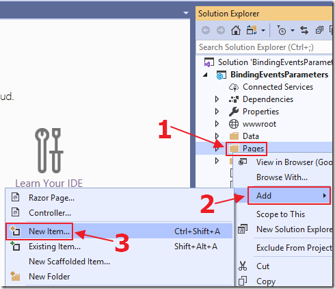
When the project opens in Visual Studio, right-click on the Pages folder and select Add then New Item…
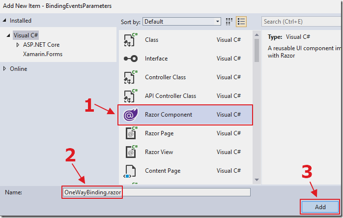
Select the Razor Component template, name the page OneWayBinding.razor, and click the Add button.

The page will display.
Add the following line to the top of the page, to implement routing for the control:
@page "/OneWayBinding"
The final code should look like this:
@page "/OneWayBinding"
<h3>OneWayBinding</h3>
@code {
}
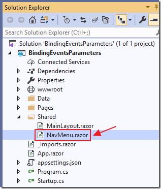
In the Shared folder, open the NavMenu.razor page.
Add the following to the menu control:
        <li class="nav-item px-3">
            <NavLink class="nav-link" href="OneWayBinding">
                <span class="oi oi-list-rich" aria-hidden="true"></span> OneWay Binding
            </NavLink>
        </li>
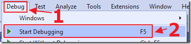
Hit F5 to run the project…
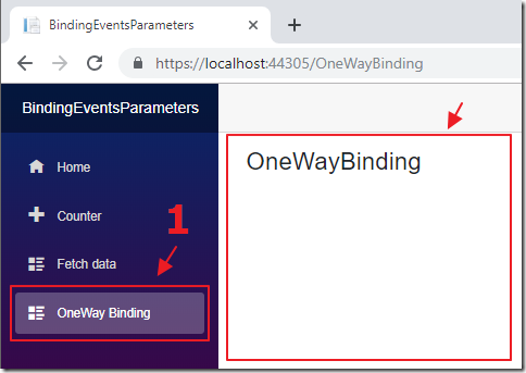
When the application opens in the web browser, you can click the OneWay Binding link in the navigation, and the OneWayBinding.razor control will display.
In Visual Studio, select Shift+F5 to stop the application.
One Way Binding
Binding allows you to set and alter a value in one part of your code, and have it display in another part of your code.
For example, you can create a property in the processing logic of a control, and display the value of that property in the User Interface (UI) markup of the control.
This is called binding and it is achieved using the @bind attribute.
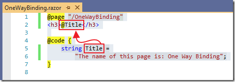
Alter the code of the OneWayBinding.razor control to the following:
@page "/OneWayBinding"
<h3>@Title</h3>
@code {
    string Title =
        "The name of this page is: One Way Binding";
}
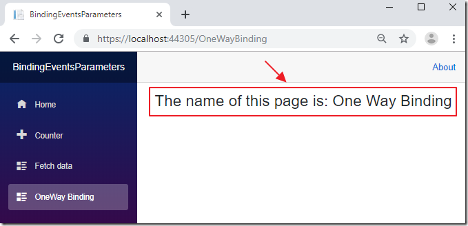
When we run the application, we see that the value we set for the Title variable displays in the UI.
Setting a value for a variable or a property, and simply consuming it is called one way binding.
Two Way Binding
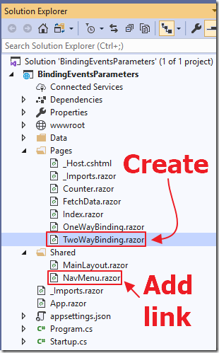
To demonstrate two way binding, create a new page called TwoWayBinding.razor, and add a link to it in the NavMenu.razor control.
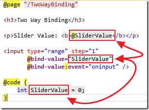
Use the following code for the TwoWayBinding.razor control:
@page "/TwoWayBinding"
<h3>Two Way Binding</h3>
<p>Slider Value: <b>@SliderValue</b></p>
@code {
    int SliderValue = 0;
}
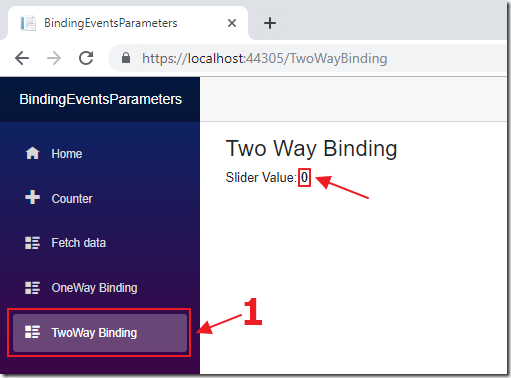
When we run the project, and navigate to the control, we see the SliderValue is set to zero using one way binding.
Stop the project and add the following code to the UI markup:
<input type="range" step="1"
       @bind-value="SliderValue"
       @bind-value:event="oninput" />
This adds a slider control to the page that is bound to the SliderValue variable. However, this time we are using the @bind-value attribute. Using this allows us to specify an an event parameter for the @bind-value attribute.
In this case we have selected the oninput parameter that will update the SliderValue variable with the current slider value each time the slider value changes.
If we did not use the oninput parameter, the SliderValue variable would not update until we clicked away from the slider control.
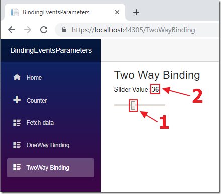
When we run the project, we can move the slider bound to the SliderValue variable, and the SliderValue variable is updated immediately and displayed.
When we manipulate a variable or property, through a UI control, rather than just consuming it, we are implementing two way binding, because the the consumer is updating the source.
Create a To Do Page
Let’s take what we learned so far about binding and create the classic to do application.
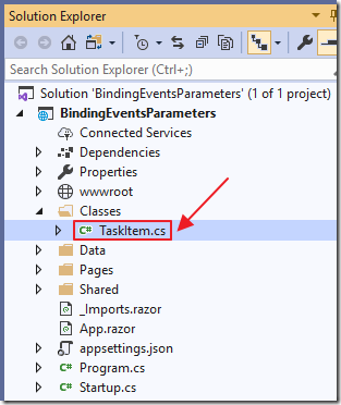
Create a new folder called Classes and add a class called TaskItem.cs using the following code:
using System;
namespace BindingEventsParameters
{
    public class TaskItem
    {
        public string TaskDescription { get; set; }
        public bool IsComplete { get; set; }
    }
}
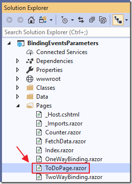
Next, add a new page called ToDoPage.razor to the Pages folder (also add a link to the control in the NavMenu.razor page).
Change all the code in the ToDoPage.razor control to the following:
@page "/ToDoPage"
<h3>ToDo Page</h3>
<br />
<ul class="list-group">
    @foreach (var Task in Tasks)
    {
        <!-- Use @key to ensure correct Blazor -->
        <!-- diffing algorithm behavior when binding a list -->
        <li @key="Task"
            class="list-group-item form-check form-check-inline">
            <input type="checkbox"
                   class="form-check-input"
                   @bind-value="Task.IsComplete" />
            <label class="form-check-label"
                   for="inlineCheckbox1">
                @Task.TaskDescription
            </label>
        </li>
    }
</ul>
@code {
    // Collection to hold all the Tasks
    private List<TaskItem> Tasks = new List<TaskItem>();
    // This method will run when the control is loaded
    protected override void OnInitialized()
    {
        // Add a Task
        Tasks.Add(new TaskItem()
        {
            TaskDescription = "Task One",
            IsComplete = false
        });
    }
}
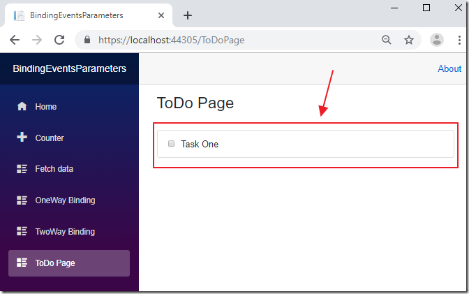
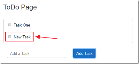
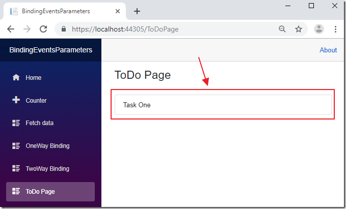
When we run the application we see that a Task will be displayed using one way binding.
Now, add the following UI markup:
<br />
<div class="container">
    <div class="row">
        <div class="col">
            <input class="form-control"
                   placeholder="Add a Task"
                   @bind-value="newTaskDescription" />
        </div>
        <div class="col">
            <button class="btn btn-primary"
                    type="button"
                    @onclick="AddTask">
                Add Task
            </button>
        </div>
    </div>
</div>
Add the following code to implement the AddTask method:
    // Property to hold the description of a new Task
    // The textbox is bound to this property
    private string newTaskDescription;
    private void AddTask()
    {
        if (!string.IsNullOrWhiteSpace(newTaskDescription))
        {
            // Create a new Task
            // using the current value of the
            // newTaskDescription property
            var NewTask = new TaskItem();
            NewTask.TaskDescription = newTaskDescription;
            NewTask.IsComplete = false;
            // Add the new Task to the collection
            Tasks.Add(NewTask);
            // Clear the newTaskDescription value
            // so the text box will now be empty
            newTaskDescription = string.Empty;
        }
    }
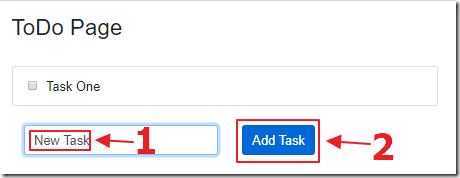
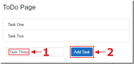
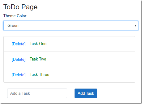
When we run the application, we can enter a new Task and click the Add Task button.
The Task is then added to the Tasks collection, and automatically displayed in the list.
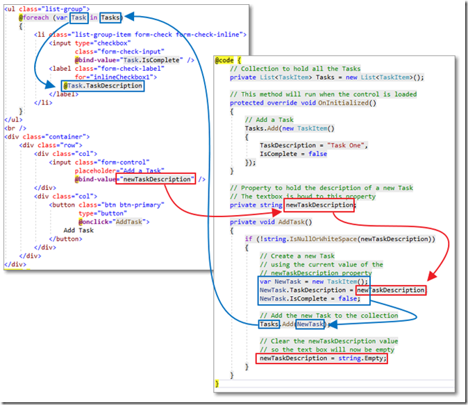
The following diagram shows how the binding works:
We can also add a Delete button to list that will pass the current Task to a RemoveTask method:
        <button type="button" class="btn btn-link"
                @onclick="(() => RemoveTask(Task))">
            [Delete]
        </button>
We then add code to implement the RemoveTask method:
    private void RemoveTask(TaskItem paramTaskItem)
    {
        // Remove the Task from the collection
        Tasks.Remove(paramTaskItem);
    }

When we run the application, we can click the [Delete] button next to a Task…
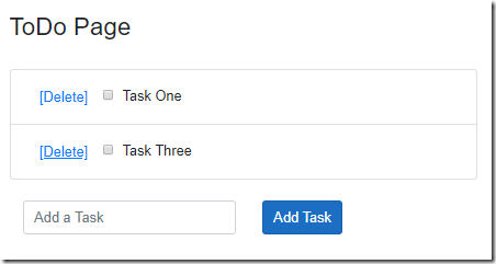
…and the Task will be removed for the collection, and the list will be automatically updated.
Finally, we can add the following UI markup to the page:
<p>
    Tasks: <b>@(Tasks.Count())</b>
    Completed:
    <b>@(Tasks.Where(x => x.IsComplete == true).Count())</b>
</p>
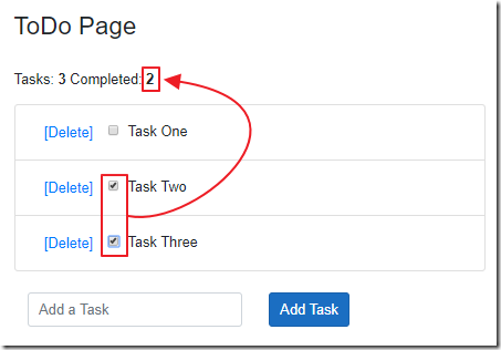
This will automatically display a count of the Tasks, and track the number of Tasks marked completed.
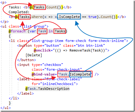
This demonstrates how bindings to properties are automatically updated in the UI whenever Blazor detects there are changes to the values.
Parameters
Parameters allow one control to set the value of properties on another control.
Create a new page called ToDoComponent.razor using the following code:
<ul class="list-group">
    @foreach (var Task in Tasks)
    {
        <li class="list-group-item form-check form-check-inline">
            <label class="form-check-label"
                   for="inlineCheckbox1">
                @Task.TaskDescription
            </label>
        </li>
    }
</ul>
@code {
    // Collection to hold the Tasks
    // passed in by the parent component
    [Parameter] public List<TaskItem> Tasks { get; set; }
}
Note that we did not define a @page attribute because we do not need routing to this component. This component will be directly consumed by a parent component.
Change the UI markup of the ToDo.razor page to the following:
@page "/ToDoPage"
<h3>ToDo Page</h3>
<br />
<ToDoComponent Tasks="Tasks" />
When we run the application we see that the Tasks collection, from the parent component (ToDo.razor), is passed as a parameter and displayed in the list in the child component (ToDoComponent.razor).
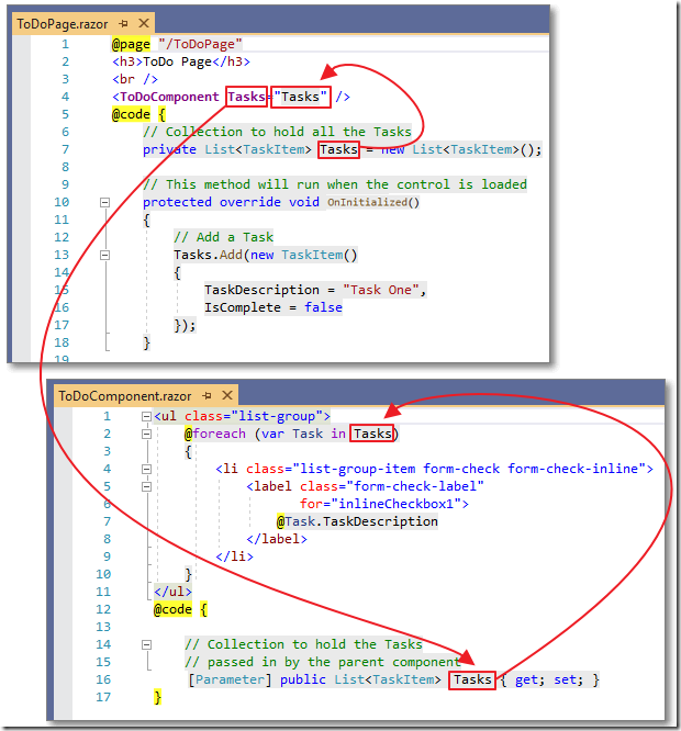
This is essentially binding as we explored earlier, however it is one way binding.
Calling A Method On A Child Component
While parameters allow us to pass values from a parent control to a child control, it will not allow us to invoke a method on a child control.
One method that will allow this, is to use the @ref attribute.
Add the following code to the ToDoComponent.razor page:
    // This method will be called directly by the parent
    // component
    public void AddNewTask(TaskItem paramTaskItem)
    {
        // Add the new Task to the collection
        Tasks.Add(paramTaskItem);
    }
Add the following property to the ToDoPage.razor control:
    // This will hold a reference to the ToDoComponent
    private ToDoComponent ToDoComponentControl;
Change the AddTask method to the following:
    private void AddTask()
    {
        if (!string.IsNullOrWhiteSpace(newTaskDescription))
        {
            // Create a new Task
            // using the current value of the
            // newTaskDescription property
            var NewTask = new TaskItem();
            NewTask.TaskDescription = newTaskDescription;
            NewTask.IsComplete = false;
            // Add the new Task to the collection
            // by calling a method on the child component
            ToDoComponentControl.AddNewTask(NewTask);
            // Clear the newTaskDescription value
            // so the text box will now be empty
            newTaskDescription = string.Empty;
        }
    }
Next, implement the @ref attribute on the ToDoComponent in the UI markup, so it now reads:
<ToDoComponent Tasks="Tasks"
               @ref="ToDoComponentControl" />
Finally, add an input control and a button to add new Tasks:
<br />
<div class="container">
    <div class="row">
        <div class="col">
            <input class="form-control"
                   placeholder="Add a Task"
                   @bind-value="newTaskDescription" />
        </div>
        <div class="col">
            <button class="btn btn-primary"
                    type="button"
                    @onclick="AddTask">
                Add Task
            </button>
        </div>
    </div>
</div>
When we run the application we are able to add Tasks from the parent control by calling the method on the child control.
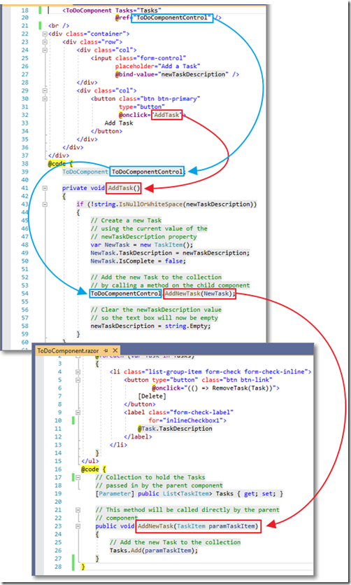
The diagram above illustrates how a reference is made on the ToDoComponent control, using the @ref attribute, and how that reference is then used to call the AddNewTask method on that control.
Events
We have explored various methods to communicate from a parent component to a child component. Events, using EventCallback, provides a method that allows a child component to communicate with a parent component.
Add the following code to ToDoComponent.razor:
    // RemoveTaskChanged is an EventCallback that will
    // notify the parent component when an item is to be removed
    // passing the item to be removed
    [Parameter] public EventCallback<TaskItem> RemoveTaskChanged { get; set; }
    private async Task RemoveTask(TaskItem paramTaskItem)
    {
        // Notify parent component to
        // Remove the Task from the collection
        await RemoveTaskChanged.InvokeAsync(paramTaskItem);
    }
Also, add a delete button (that will appear next to each list item), that will call the RemoveTask method (passing the current Task):
            <button type="button" class="btn btn-link"
                    @onclick="(() => RemoveTask(Task))">
                [Delete]
            </button>
When we look at ToDoPage.razor we see we already have this method to remove a Task from the collection:
    private void RemoveTask(TaskItem paramTaskItem)
    {
        // Remove the Task from the collection
        Tasks.Remove(paramTaskItem);
    }
Finally, we need to update the ToDoComponent tag to indicate that the RemoveTask method is to be invoked when the RemovedTaskChanged event handler is invoked in the child control (ToDoComponent.razor):
<ToDoComponent Tasks="Tasks"
               @ref="ToDoComponentControl"
               RemoveTaskChanged="RemoveTask" />
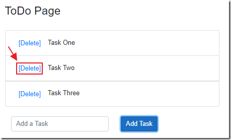
When we run the application, we can now click the [Delete] button…
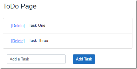
… to remove a Task from the list.
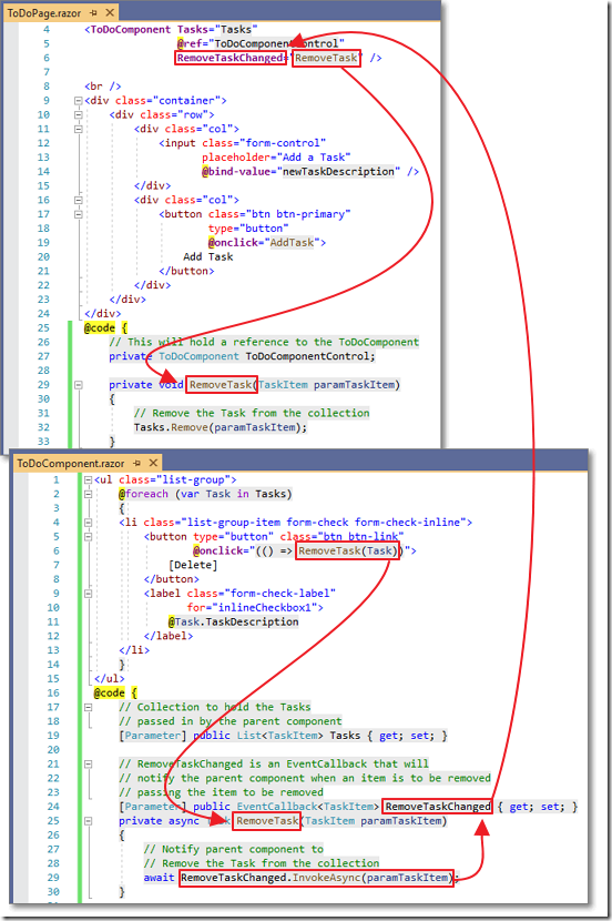
The diagram above shows how the child component raises the event by calling InvokeAsync passing the currently selected Task as a parameter.
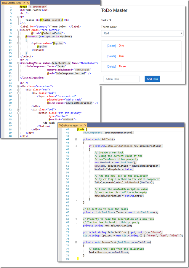
Cascading Parameter
The final example will demonstrate cascading parameters. A cascading parameter is different from a normal parameter in that the value of the cascading parameter will pass to all child controls that declare the parameter.
Add the following code to ToDoPage.razor:
    // SelectedColor will be the cascading parameter
    // Set the color to Green
    protected string SelectedColor { get; set; } = "Green";
    // Create a collection of colors that will be bound to a dropdown
    List<string> Options = new List<string>() { "Green", "Red", "Blue" };
Add the following UI markup to the page, to display the currently selected color and a dropdown to allow it to be changed:
<label for="Summary">Theme Color: </label>
<select class="form-control"
        @bind="@SelectedColor">
    @foreach (var option in Options)
    {
        <option value="@option">
            @option
        </option>
    }
</select>
<br />
Finally, surround the ToDoComponent tag with the CascadingValue tag, to name the cascading parameter ThemeColor, and to pass the SelectedColor variable as its value:
<CascadingValue Value=SelectedColor Name="ThemeColor">
    <ToDoComponent Tasks="Tasks"
                   @ref="ToDoComponentControl"
                   RemoveTaskChanged="RemoveTask" />
</CascadingValue>
In ToDoComponent.razor add the following code:
    // Declare the ThemeColor CascadingParameter
    // from the ancestor control as ThemeColorParameter
    [CascadingParameter(Name = "ThemeColor")]
    protected string ThemeColorParameter { get; set; }
Next, alter the label in the UI markup to the following, to allow the color to be set by the value of ThemeColorParameter:
        <label class="form-check-label"
               for="inlineCheckbox1"
               style="color:@ThemeColorParameter">
We can run the application…
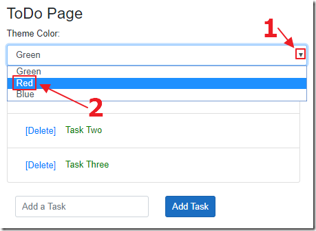
… change the value of the cascading parameter…

… and the value is immediately updated on all child components that declare and implement the parameter.
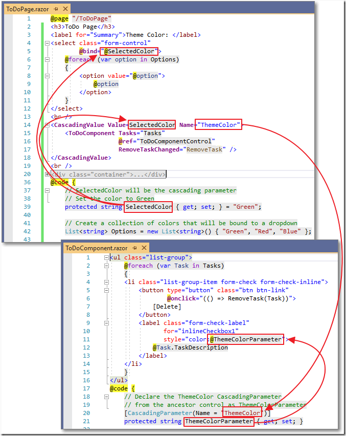
The diagram above shows how the cascading parameter is declared and consumed.
Links
Download
The project is available on the Downloads page on this site.
You must have Visual Studio 2019 Version 16.3 (or higher) installed to run the code.